Mobile SEO: How To Optimize Your Site For Any Device
May 01, 2023 | prashant@growth.cxWe live in a world where having a mobile-friendly website is essential for businesses to succeed online. With more people using their mobile devices to access the internet, having a website that is optimized for any device is crucial to reach and engage with potential customers.
So how to optimize the SEO for mobile searches? The answer will be to optimize your site for any device.
In this blog, we will explore the importance of mobile optimization, share best practices for designing a mobile-friendly website, and provide tips for improving site speed and performance.
Let’s dive in!
Understanding Mobile SEO

Mobile SEO, or mobile search engine optimization, is the process of optimizing a website for optimal viewing and functionality on mobile devices. This includes ensuring the website adjusts to fit different screen sizes, loads quickly, is easy to navigate and has content that is easy to read on a small screen.
The goal of mobile SEO is to improve a website’s visibility and rankings in mobile search engine results pages, which in turn can drive more traffic and lead to the site.
Here are some key points to keep in mind:
- Over 60% of internet users access the web via mobile devices, making mobile optimization crucial for reaching a wider audience
- A mobile-friendly website can improve user experience, boost engagement and conversion rates, and help improve search engine rankings.
- Mobile devices have smaller screens, slower internet connections, and different user behavior compared to desktop devices, which means that SEO strategies for mobile and desktop need to differ
- Mobile SEO focuses on factors such as page load speed, site responsiveness, and mobile-friendly design
- In 2018, Google announced that it would be moving to mobile-first indexing, meaning that Google now primarily uses the mobile version of a website for indexing and ranking
By prioritizing mobile optimization, businesses can ensure that their website is accessible and engaging for mobile users, leading to increased traffic, engagement, and conversions.
Designing a Mobile-Friendly Website
The fundamental and most crucial step in optimizing the website for mobile devices is website design. When you design a website that looks great on both mobile and desktop, then you are winning the half battle already.
Designing a website that looks great on both desktop and mobile devices can be challenging. Let’s take a look at how we can design a website that is mobile-friendly.
Following is an example of a mobile view of the SuiteJar website.
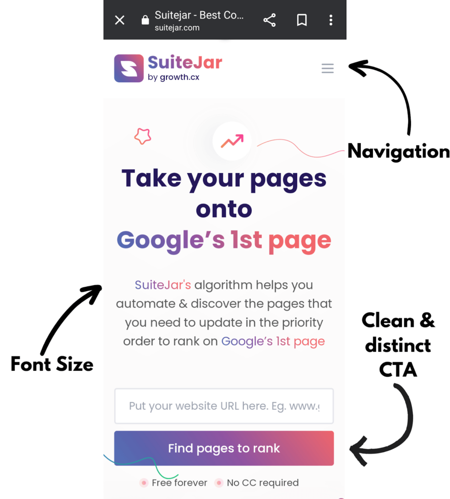
Responsive web design
Having a responsive design ensures that your website adapts to different screen sizes and orientations, providing the best possible user experience across all devices. This means your website will look great on smartphones, tablets, and desktop computers.
Mobile-friendly site navigation
Navigation is one of the most important aspects of any website, and it’s even more important on mobile devices where screen real estate is limited.
A mobile-friendly navigation menu should be easy to use and allow users to find the information they’re looking for quickly.
Optimizing images and media for mobile devices
Large images and videos can slow down page load times on mobile devices, which can lead to a poor user experience. Optimizing your images and media for mobile devices by compressing them and choosing appropriate file formats can help improve page load times.
Implementing clear and concise content
Mobile users are often on the go and don’t have time to read lengthy paragraphs or complicated content. Therefore it is important to implement clear and concise content that is easy to read on small screens.
Use short sentences and paragraphs, and break up text with headings and subheadings to make it more scannable.
Improving Site Speed and Performance
When it comes to mobile SEO, site speed and performance also play a critical factor.
Slow loading times can negatively impact user experience, causing visitors to leave your site before even seeing its content. Therefore increasing the bounce rate.
Since page loading speed is also considered a ranking factor, it is crucial to have a good page speed. The faster your site loads, the better the user experience, and the higher the chances of ranking higher on SERPs.
Tools for measuring site performance
Before optimizing your site’s speed, you need to measure it. There are many tools available to check your site’s performance, such as Google PageSpeed Insights, SuiteJar, and Pingdom.
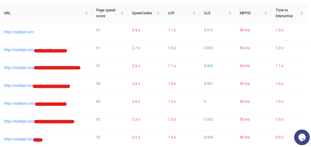
Techniques to reduce load time
Now that you have measured your site’s performance, you can use the following techniques to reduce load time:
- Minify CSS, HTML, and JavaScript: This means removing any unnecessary code, whitespace, and comments from your site’s code to make it more lightweight.
- Enable browser caching: This allows your site’s files to be stored in a user’s browser cache, reducing the amount of time it takes to load the site on subsequent visits.
- Optimize images and videos: Large images and videos can slow down your site. optimize your images by compressing them without compromising their quality. You can also use lazy loading to reduce the load time of images and videos.
- Leverage Content Delivery Networks (CDNs): A CDN is a network of servers that store cached versions of your site’s content in different locations worldwide. This can help reduce the load time of your site by serving the content from the closest server to the user.
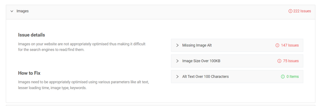
With a tool like suitejar, you will be able to quickly find the errors, guides on how to remove them and improve your website health faster.
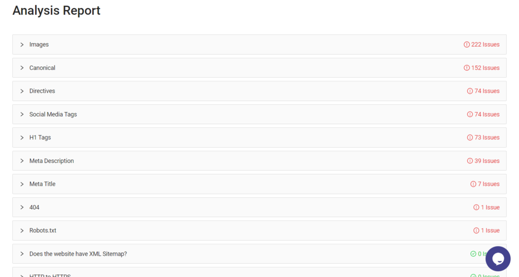
You can understand the images missing alt text, with soze over 100KB and more.
Mobile UX (User Experience) Best Practices
Mobile devices have small screens compared to other devices like laptops and tablets. And when it comes to mobile UX design, there are some best practices you should keep in mind. These practices can make a big difference in how users interact with a website on their mobile device.
Prioritising content readability:
- Use easy-to-read fonts and font sizes
- Ensure that there is enough contrast between text and background colours
- Keep paragraphs short and use bullet points and headings to break up content
Creating touch-friendly design elements:
- Use larger buttons and clickable areas to accommodate for users’ fingers
- Make sure that buttons and links are clearly visible and distinct from other elements on the page
- Avoid using hover effects, which don’t work on touch screens
Streamlining forms and calls-to-action:
- Keep forms as short and simple as possible, only asking for necessary information
- Use clear and concise language on buttons and calls-to-action to clearly indicate what action the user is taking
- Use autofill features to make the form-filling process easier for users
Ensuring site accessibility for all users:
- Use alt tags for images to ensure that users with visual impairments can understand the content
- Ensure that the website can be navigated using a keyboard, for users with motor impairments
- Provide closed captioning or transcripts for any video content on the website.
Pro Tip for Mobile UX designers
1. Phone size and Holding position
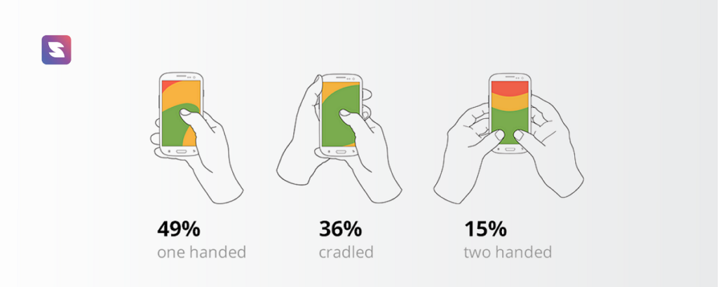
On a desktop site, modules can go almost anywhere. On a mobile device, however, you may not have considered the limitations you will face. Depending on how people hold their mobile devices, they may be able to interact with your site in different ways, based on the amount of screen they can access.
In the above chart, you can see the most popular way to hold a cell phone is using your thumb. Of all the three options, it has the least reachability, meaning the user has a smaller range of motion.
Place clickable content in more accessible areas of the screen by understanding your users’ range of motion, such as avoiding the corners and top.
Phone screens have been getting larger, which means you can fit more content on a page, but it also limits the reach of the user.
2. Eliminate Exit Pop-up
In mobile devices it is more difficult for a user to close pop-ups, the more likely he or she is to leave the site altogether.
The best course of action for pop-ups on mobile devices is to avoid using them whenever possible. This includes promotions, advertisements, and any other pop-up you may have in place.
Make use of CTAs that lead to landing pages instead of pop-ups rather than using pop-ups. Be sure that if you can’t avoid using pop-ups, you perform extensive user testing to ensure it is easy for the user to close them on any and all devices.
By prioritising these mobile UX best practices, businesses can create a website that is easy to use and navigate on any mobile device.
Local SEO and Mobile Devices
Whether it’s searching for a nearby restaurant or finding the best deals on the go, people rely on their smartphones to provide quick and convenient access to information. For businesses, this means that having a mobile-friendly website is no longer an option but a necessity.
In addition to having a mobile-friendly website, businesses must also consider local SEO to reach their target audience effectively. Local SEO is the practice of optimizing a website for location-based searches.
With the rise of mobile devices, the importance of local SEO has grown significantly.
According to a study, over 30% of mobile searches are location-based. This means that users are actively looking for businesses and services in their area. By optimizing your website for local searches, you can increase your visibility and reach potential customers who are nearby.
Optimizing Google My Business listings
One of the most important steps in local SEO is to claim and optimize your Google My Business (GMB) listing. GMB is a free tool that allows businesses to manage their online presence on Google.
By optimizing your GMB listing, you can provide users with accurate and up-to-date information about your business, such as your address, phone number, hours of operation, and website URL. This can help users find your business more easily and increase your chances of appearing in local search results.
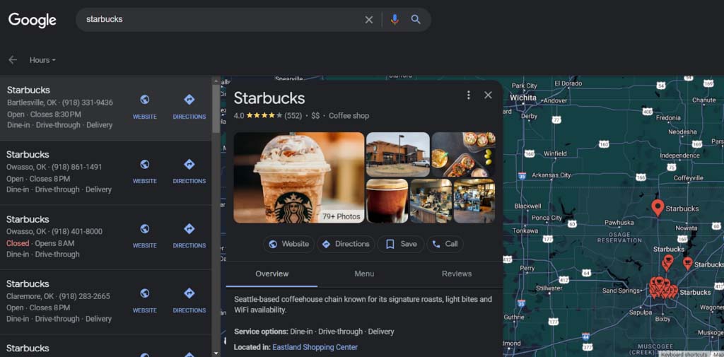
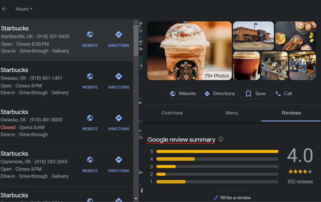
Following is an example on how Starbucks leveraged Local SEO.
Encouraging customer reviews and ratings
Reviews and ratings are an important factor in local SEO. Positive reviews can help improve your business’s visibility and credibility, while negative reviews can harm your reputation. Encourage customers to leave reviews by adding a review link to your website or sending follow-up emails after a purchase.
Utilising local schema markup
Local schema markup is a code that provides additional information about your business to search engines. By using local schema markup, you can provide search engines with details about your business, such as your address, phone number, hours of operation, and reviews. This can help improve your business’s visibility in local search results.
Optimizing your website for mobile devices and local SEO is crucial in today’s digital landscape. By implementing these best practices, businesses can improve their online visibility, attract more customers, and stay ahead of the competition.
Mobile SEO Technical Considerations
Like we gave importance to design, speed and more, we need to concentrate on the technical side of SEO too. In this section, we’ll explore some technical considerations for mobile SEO that can take your website to the next level.
Mobile-friendly URL structure
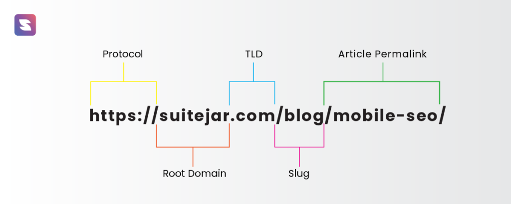
Make sure your website’s URL structure is mobile-friendly and use short, descriptive URLs.
Implementing structured data for rich results
Structured data can improve the appearance of your website in search results. Use schema markup to provide search engines with information about your website’s content.
Rich results can increase your website’s visibility and attract more traffic
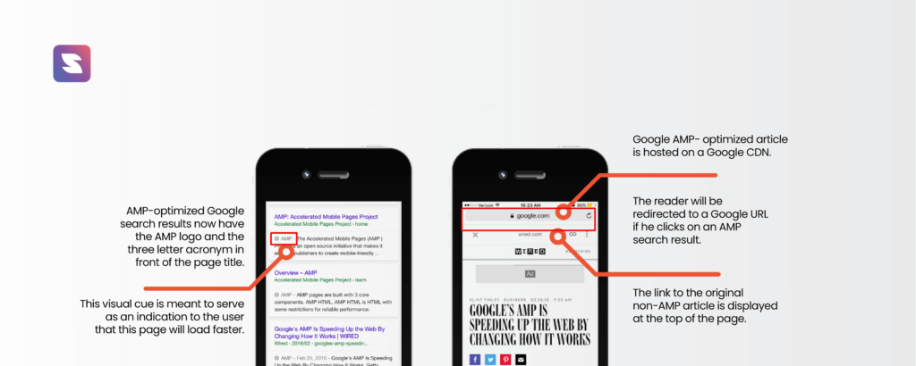
Accelerated Mobile Pages (AMP)
AMP is an open-source framework for creating fast-loading mobile pages. It load quickly and provide a better user experience for mobile users.
Implementing AMP can improve your website’s mobile SEO and increase your website’s visibility.
By implementing these mobile SEO technical considerations, you can ensure that your website is optimized for mobile devices and provide a better user experience for your mobile users.
Conclusion
In conclusion, having a mobile-friendly website is crucial in today’s digital world. By optimizing your website for mobile devices, you can increase your reach, engagement, and conversions.
There are many tools and resources available to help you optimize your website for mobile devices. While you have Google’s Mobile-Friendly Test and GSC [Google Search Console] to help you with mobile seo, It’s best to use SEO tools that go above beyond. Suitejar is one such tool.
It offers a comprehensive suite of SEO tools, including an audit tool to assess your website’s mobile-friendliness to one of a kind feature that help you optimize your existing content to rank on google’s first page.
Try the tool now to optimize your website for mobile and boost your customer experience.
Proudly from India
Prudently for the globe.
Quick Links
Business Address
WeWork Vaswani Chambers 2nd Floor, HD-234, Plot no. 264-265,Dr Annie Besant Rd, Worli Shivaji Nagar,
Municipal Colony, Mumbai,
Maharashtra, 400030 hello@suitejar.com

SuiteJar is a Startup India approved startup.